Monday 15 April 2013
Editing Diary
 This is a diary that I kept of the time I took during the editing process. The calculated number of hours was 11, however, I did not include small tweaks that were made over short periods of time (10 minute sessions at the edit suite), thus 11 hours is not an accurate representation of the time spent but a rough estimation.
The 11+ hours are reflective of the finished product which took much development and evolution to become the video it has turned out to be: very developed and an obvious amount of hard work to get a completed video.
The diary process helped keep record of when certain editing sessions happened and therefore could be referenced in the furture should I need to recall an event that happened.
The diary process helped keep record of when certain editing sessions happened and therefore could be referenced in the furture should I need to recall an event that happened.
Monday 8 April 2013
Evaluation: Effectiveness of Main Product (video) & Ancillary Texts (digipak/magazine advert)
As Alex
explained, the constant underpinning of the video and
my ancillary texts was psychedelic imagery and geometric
shapes. This was also brought up from the audience feedback I
received from the AS Media class that I was given feedback from. The constant
colours of green, blue and red are seen throughout, on video, advert and
digipak (especially the disks). This is an example of how colour scheme is
utilised throughout a media product.
Continuing
the idea of colours and imagery, the element of water and fluidity is seen.
This was connected to the narrative of the video and lyrics of the song, with
reference to 'seals', 'sharks' and swimming. The imagery used in the video
purposely replicates this idea of water as an element that
is suppressing our protagonist and giving a sense of drowning and
struggling to get to the surface. The fluidity of the disks that I have created
give this connotation. Additionally, the ambiguous texture on the cover
of the digipak could represent the waves of a river or of the sea, foaming.
Finally, the connotation of fluids continues on to the texture of the magazine,
as Sam's face looks as though it is 'dripping' away.
The
geometric, triangular patterns and reference to the number three is used
constantly throughout all three texts. The video utilises the composition of
the frame, where Fran tends to be center frame with Sami and Sam
either side of her, denoting this concept of a 'love triangle'. Towards the end
of the video, the protagonist Sam draws a triangle, making it obvious
that the three characters are involved in this. Geometric graphics are used
behind Sam on the magazine advert, yet actually in a tessellation patter
working with the theme of the video and the 'toe to toe' / 'back to back' lyric
denoting Joe Newman's explanation of the song being about 'intimate
embraces'. The triangle geometry of the digipack artwork is also a tessellation
pattern yet zoomed in on to one specific triangle with the artists name and
title of the album itself.
With Sub Pop Records as my designated record label to release this digipak with, this means that Warner will be the distributors of the album. This means that I would be able to utilise the media giant Warner Brothers' other media departments, which would be an example of synergy. I could release the second disc available with the digipak as a DVD (which was my original plan) and use their Home Entertainment arm to also produce and distribute this extra disk of film footage. On this DVD would be the music video for 'Tessellate', thus the coherency of using the many factions of a major media institution to display many of my texts.
Evaluation: Use of New Media Technologies
 This is the camera that was used to video footage: Panasonic Lumix G2. The reason for using this camera was that it was a possession of Kate's, thus making it convenient for usage whenever necessary to film. We also had a tripod at our disposal, so that stable, stationary shots could be filmed without the camera shake as opposed to hand held. The Lumix G2 films in HD, guaranteeing high quality footage to be captured. However, one slight drawback to using this advanced photographic equipment was the camera's tenancy to shift focus which was exasperated by the constant light flickering from the strobe lighting used; the camera naturally attempts to focus on lightened areas and with this light constantly changing, there was some peculiar focus issues. Another problem had occurred from an accident involving a sticky fluid getting on the camera lens, where it was needed to twist to zoom in/out. This made the zooming difficult and often meant that zooming must occur in small sequences, creating a jumping effect. This can be seen in the drafted video, where the blue scarf is drifting in the wind; I had to cut twice to cancel out the jumpy zoom cinematography, making the editing look intentionally closer and closer. However, the end result of this problematic, technological fault proved advantageous as an end result.
Other video editing software are available, such as Windows Movie Maker which is a program that is on all standard Windows machines. However, Windows Movie Maker is a simplistic editing program compared to Premiere Pro. The perks of Premiere Pro over Windows Movie Maker is that multiple video tracks allow overlaying and the availability to make editing techniques such as split screening. Premiere Pro also gives complete audio manipulation, such as fading in /fading out the audio when chosen, unlike windows movie maker which does not. So, in conclusion, Premiere Pro is a more versatile and dynamic program offering much more variety. This is why I used Premiere Pro.
Using such a powerful program to edit meant that creative visual possibilities were open, including the split screening technique seen in my music video, as well as the application of effects overlaying a piece of footage to make the video more aesthetically appealing. Split screen editing is done by the following process:

 The footage with the crop effect will have an 'effects control' tab, to precisely manipulate the effects that have been put on a piece of footage. In this menu, there are four options of 'top','bottom','left' and 'right' which are positions of the frame. These can be scrolled to make that part of the frame disappear thus revealing the footage underneath. The crop will create a line, thus it is essential to make the split screen crop blend naturally in to the shots so that no prominent, obvious line is seen.
 To create my ancillary texts, it was mandatory to use Adobe Photoshop, another example of industry standard software used to create a hypothetical media text. Due to using Photoshop numerous times over the past two years (primary portfolio work: music magazine), following experimental and self-learning of the program, my skills using Photoshop have evolved significantly. For example, the use of the photo manipulation tools to completely distort the face of Sam on my magazine advert: I would never have thought to do this previously.
Alternative programs do exist, yet as an industry standard photo manipulation program, Photoshop is undoubtedly the best. GIMP is a free alternative to Photoshop, available on Windows, Mac and Linux, thus stives over the £1000 or so pound that Photoshop costs. GIMP has almost all the same tools that Photoshop has, yet are not as precise. The Photoshop community also offers plug-ins, extensions and add-ons helpful for expanding the interface. GIMP, however, does not have the same community and expansion ability. For this reason, Photoshop is above and beyond other manipulation software.
The psychedelic visual graphics seen throughout the video come from an Xbox 360. The Xbox 360's music player application comes with a visualizer which moves to the melody of the song played. The original idea was to make a kaleidoscope effect, yet the effect of the visuals worked so well alone, there was a decision made to use them throughout. They also relate to the psychedelic style of my ancillary texts as well as the vaguely psychedelic sound of the song. The idea to create a psychedelic ancillary texts stemmed from these visuals. The use of this Xbox visualiser was easily accessible and a simple domestic appliance, that is why this was used. Here is a video demonstrating the visualizer synchronised with the music player:
 Blogger itself could be considered as a new media product that I have used during this project. Blogger is a product of Web 2.0 which enables internet users to utilise elements of personalisation through use of HTML editing: embedding videos, importing images and altering text. Additionally, Blogger is technically a social network site, allowing the user to network with every other Blogger user. The free accessibly of Blogger means that there will be no pay-outs to be made to display my work. Other alternatives do exist to publish your work on a blog such as Wordpress, yet Blogger is part of the Google family, therefore it is linked to my YouTube account, my Gmail account and other online services that are connected to Google. This is an example of technological synergy used to an advantage. Google also comes with an 'Extensions' engine that allows additional add-ons to be integrated into the users interface, allowing maximum personalisation of Chrome. Some of the add-ons I use are: the RSS Reader (seen at the top right of the photo) which feeds me news and podcasts in real time to pages I select; the AVG anti-virus software, which tells me which pages have suspected malware or other viruses embedded on them; and Ad-Block which stops adverts on certain webpages and YouTube videos to pester me. This personalisation element of Google Chrome, as well as the accessibility to the websites in the 'Google Family' make it my personal favourite web browser.
 Linking to this is the use of Google Chrome over the conventional Windows Explorer. Using a Gmail account on Google Chrome allows access to your whole Google Chrome, such as the bookmarks you leave on it when you are at home, favorites, access to YouTube account, Blogger account and even search history. The screen shot above is a screen shot taken at college that uses this interface and is exactly the same at home. Internet Explorer does not have this convenience and synergistic advantage, thus use of Google Chrome over Window's Internet Explorer.
 YouTube is the third most popular website (according to Alexa traffic rank, November 2012) beaten only by Facebook and Google itself. The use of YouTube gives the availability of streaming videos of all sorts: from instructional to entertaining. YouTube, as part of the Google interface, is convenient for this project to be connected to the other networks mentioned above. YouTube has a simple drag and drop upload system that utilises the simplicity of transferring videos on to YouTube. However, I did have some problems with YouTube. Liberation Music filed a complaint that I was breaching 'copyright infringement' for my use of Alt-J's audio, despite clearly stating that I accept that my video uses third-party information that does not belong to me. For this reason, YouTube pulled the video from my account. Fortunately, the video still plays on my Blogger as it is embedded, yet this is temperamental and sometimes the message about the removal of the video appears.
 This is the card reader which I used all throughout the project. Rather than using a pen drive, the use of a card reader enables a variety of memory card styles to be inserted into the reader to convert data from one computer to another. Additionally, the use of an SD card rather than a pen drive memory stick is that the SD can be plugged directly into a camera, then transferred simply onto the chosen computer. However, SD cards are small and may get lost. I fortunately did not face this problem, however, using such a small memory (2GB or 4GB cards) for such a large project required numerous memory cards. Eventually I found myself with 6 different cards with various footage and files on, which was not an ideal situation to be in: having to plug every card in to see if it is the correct one. I did label one or two of the major cards that held the most vital information, yet still others were slightly problematic and tedious. Despite these flaws, I still prefer the convenience of plug-film-transfer and storing all other files for this project on one card.
 Evaluation: Response to Audience Feedback
 This is the visual audience profile that was created earlier on in this project to captivate and portray the interests of my audience in one large collage. This was done by using the questionnaire tool on the right-hand margin of the blog and sharing the link for people to answer. This audience feedback gave a strong indication of what I was to be put into the music video to directly appeal to my audience: musically, visually, contextually and referentially. Some examples of this are the abstract,montage editing that was to include artistic and creative content: the psychedelic flares, vivid imagery, landscape shots, experimental slow-motion and split screening (or a combination of both!).
Using the profile, I judged that as a young audience of 16-19 would use some sort of online networking such as Twitter, fa Facebook or Instagram. For this reason, I used these media forms to share the music video to the public to view. This proved effective, as it gained a substantial amount of views considering small scale of the video in such a short period of time.
Examples of hypothetical texts including the Spotify streaming service, as well as iTunes downloads can be seen in this Prezi taken from this post:


These are screen shots of my personal use of social networking to publicise my music video. The use of social networking not only conformed to a convention of media texts and their way of publication, yet also would directly target my target audience. This is due to the majority of my friends/followers on Twitter, Facebook and Instagram being the same age as me. Also, as a free method of publicising the music video, was completely, 100% efficient.
The feedback received wasn't exactly technical or helpful, yet received good reception from the people who did decide to check it out. With this in mind, I thought that the best way to receive a relevant feedback from people who actually know what they are talking about, with media jargon in their vocabulary, thus could get feedback from a media class. I chose an AS class and used anonymous question sheets with the following questions to answer after viewing my music video:
- How does the video visually match the audio, 'Tessellate'?
- Of these (multiple choice) which type of narrative is this video: Abstract, Performance, Narrative, Animated or other (please state)?
- Strengths?
- Rooms for Improvement?
I received 14 feedback sheets with a variety of positive and negative aspects about my music video, written in more elaborate and evaluative way than simply 'good' or 'bad'. The questionnaire proved useful as the anonymity of these feedback sheets meant that the class wouldn't fear offending me, thus would be truthful in their feedback.
The answers to the questionnaire varied, yet here are some responses:
- How does the video visually match the audio, 'Tessellate'?:
- "I think the way the image flickers to the beat is very effective and your overall imagery is fitting to the music, almost hypnotising. Very interesting"
- "it matches the audio as it reflects the sort of psychedelic atmosphere"
- "the cuts match the beat of the music. Scenes in the video make reference to the lyrics."
- "The approach emphasises the theme of tessellation so abstract shapes and patterns interlocking together and with the music"
- "the hypnotizing mood of the song matches the section with the bright coloured patterns"
- Of these (multiple choice) which type of narrative is this video: Abstract, Performance, Narrative, Animated or other (please state)?:
All of the feedback sheets read "abstract" yet one feedback sheet included the addition of "narrative, animated"
- Strengths?:
- "I think the way you edited the clip was interesting and created lots of different effects. Also, the camera angles used throughout, and the cinematography subject like the clip where a rock is being thrown into water, created a very abstract, meaningful feel."
- "Editing effects of switching between each clip (faces). At the beginning, the tree effect looked really good. When one person was running and one was walking all in the same clip. Reversal of clip (smoke)"
- "creates a sense of mood that evokes the track unusual and hypnotic use of graphics/patterns and shapes - juxtaposed with the faces. The idea of creating a visual collage of tessellating images on a video is intriguing."
- "Very well thought out. I loved the vibrant colours and great effects"
- "Lots of nice lights works well. Matches the music. It is simple but not boring and the video is in sync with the beats of the music. The whole video has a good flow. The wild west shoot out is really good! Random, not sure how this matches the video but it works"
- "maybe the part when the river goes on a tiny bit too much, I would cut that out maybe once"
- "It looked too simple in parts. I would encourage more enthusiasm, location-wise - setting was dull"
- "Too much going on at the same time. Maybe there doesn't need to be as much editing. It's just the pace of the whole thing which creates a good effect. There could be a small amount of editing, but more pace used throughout and would still come across as pleasing"
- "May have concentrated on emphasising the hypnotic mood - some ideas a bit cliched such as the reverse motion of smoke being exhaled. Not falling into the unified idea of 'tessellation'. A good video that doesn't quite follow through with its main concept, but a swift re-edit would solve this."
- Many of the comments criticized to the loose narrative involved in the music video.
Feedback is essential to see the flaws in your work that you are unable to see, especially when the feedback is from the target audience of my product. It is vital to consider the feedback as highlighting the products strong points as well as giving a basis for improvement, if there was time to edit the product or for future prospects if a similar project was to happen.
From this feedback, I have concluded that my target audience have identified with the psychedelic/hypnotic visual style that I attempted to portray through moving coloured graphics. Coupled with this is the use of the 'strobing' effect and flickering images, a show of how editing has been successfully used to create an intentional visual collage. This is also shown of my ancillary texts, where feedback shows that the hypnotic visuals and the geometric patterns that have been followed through to the digipak and album cover. Additionally, the audience have appreciated that the video has been rhythmically edited, a careful procedure that took extra fragility with clips and placement of the footage. It is apparent that the audience have appreciated the prominence of editing and its impact on the visual portrayal of the video.
It is obvious that there is some content in the video that weakens it. As the constructor of this text, I am able to understand the meaning and reason for certain shots in certain places, which is actually an elaborate construct, yet in hindsight some of the audience may not understand this. For example, some of the feedback showed that the audience did not understand the inter textual reference to The Good, The Bad and The Ugly. However, this was the basis of my video: to depict the active audience from those who were unable to relate to this reference and it's significance to the narrative of the video ('three guns and one goes off').
Criticism showed that there was no explicitly obvious narrative construct embedded within the video, yet some of the audience disagreed with this point. This again relates to the previous point about an audience who understands the context of the narrative and those who don't. This makes it clear to me that my target audience is more of a niche than expected, which is split in terms of who understands and can relate to the narrative and those who are unable to.
Sunday 7 April 2013
Evaluation: Use, Development or Challenge of Conventions
Reiteration of the video for the Crystal Fighters single ‘At Home’ was substantially the influence for the main locations and settings for the mise-en-scene of the music video and, as we can see here with the side-by-side comparative method of video my music video and the video to At Home. The decrepit building and the forest setting, combined with the abstract/fractured narrative style can be seen to be a major influence of mise-en-scene. Not only mise-en-scene and setting decisions were taken from the At Home video, yet also editing techniques, such as the long shots of setting juxtaposed by a dissolve transition to denote emotion or feeling of the characters in the video; the opening shot of the river fading to the singer of At Home is mirrored in my music video, towards the end of the video (2.50-2.58 approximately). This extreme long shot to medium-close up of a character juxtaposition in my video denotes the previous beauty of his relationship, with a suggestion of romantic , scenic locations which has now resulted in the protagonist's independence and the loss of this love. However, this technique seen as the first two shots of the At Home video denotes the freedom and opportunistic possibility of this group of friends - an open terrain as their playground. Thus, despite borrowing this technique from the At Home video, I have used it for different purposes.
 Using this technique in my video proved difficult. Two split screen edits were used in total; the long shot of Sami running in slow motion at Sam/Sam turning and the long shot of the three Sams in the shot. The split screen is done by taking multiple shots of footage, yet being very careful not to move the camera as the split screen may be visible in the shot should there be mis-positioning in one shot that varies from the positioning from another. For example, the shot of the three Sams, there is a visible line where the cropping of the split screen is visible, in the right third of the frame.
 Another difficult factor with the split screening was the slow motion. Due to the editing machine that functioned Adobe Premiere Pro (the industry standard software used to edit the video) having specific settings to the frame rating of the video, and the precise frame rating that the video had to be - the video I produced was set at 25 fps - then obscuring the motion meant altering the frame rate. This difficulty can be seen in the slow motion split screen of Sami running as this is slightly jittery in the motion, as opposed to the real media text, Radiohead's video, which would have used a camera and software specifically designed for capturing slow motion images with high frame rates.
Another contrast of these two videos is the use of stationary cinematography of my video (with maybe a few exceptions, using hand held camera) with use of pans and tilts versus the constant hand held cinematography to provoke mobile framing. This is due to the dependency of movement in the At Home video by cinematography to denote the notion of journeying and adventure, whereas my video does this through editing techniques and composition in the shot of the characters; the triangle formation and the number three is prominent in the video to represent the 'love triangle'.
Another inspired technique taken from an existing media text is the editing technique known as 'split screening'. Split screening requires great precision and can express multiple, contrasting shots within one scene or shot. Radiohead's video for the single 'Street Spirit (Fade Out)' uses this technique throughout, using slow motion split screens within a shot of real-time motion to create a contrasting effect of time, creating an obscuring effect. This coincides also with the abstract, obscure design on my digipak.

 Another difficult factor with the split screening was the slow motion. Due to the editing machine that functioned Adobe Premiere Pro (the industry standard software used to edit the video) having specific settings to the frame rating of the video, and the precise frame rating that the video had to be - the video I produced was set at 25 fps - then obscuring the motion meant altering the frame rate. This difficulty can be seen in the slow motion split screen of Sami running as this is slightly jittery in the motion, as opposed to the real media text, Radiohead's video, which would have used a camera and software specifically designed for capturing slow motion images with high frame rates.
Initially, the dissolving editing technique was also taken from the Street Spirit video, where she shot dissolves in multiple layers of a close up of the front man Thom Yorke's face (3.28 - 3.36).
Here is the 'Rough Cut' copy of the imitation of that dissolve transition editing:
Here is the 'Rough Cut' copy of the imitation of that dissolve transition editing:
A decision was made to remove this from the final edit as the technique was too sharp in the edits rather than the coherent and flowing transitions of the Radiohead video. Instead,this sequence was replaced by a less intricate yet still effecting lip-syncing sequence by Sam, also including the motif of the strobe lighting (2.27 - 2.35). This is an example of how replicating, or attempting to replicate a professional piece of editing can result in failure, yet then develop an equally as effective editing sequence that still uses the foundation of the existing media text.
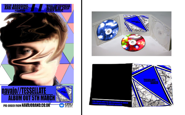
Ancillary Texts: Digipak


Ancillary Texts: Digipak


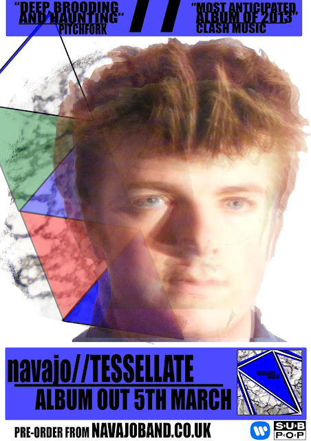
This is my chosen geometric digipak design next to some real media texts that I showed in my research. In terms of graphology and organisation of the page with reference to media language, the conventional artwork as well as the title of the album and the artist can be seen, which is conventionally speaking, the only text on the cover. The prominence of colour and bright coloured artwork is also conventional of artwork of this specific genre - with the exception of the Caribou album pictured in black and white. However, geometric wasn't the only stylistic that I chose for visual inspiration, I combined this basic geometric with intricate textures to create a marbled effect embedded within the triangular shapes. This denotes the intricate interior, despite the basic exterior: similarly mirroring the emotions represented in the music videos. This an example of how artwork and graphics match a synergistic result, also with the shape of triangles also present in the video as well as this digipak. This is my challenging the convention by using a hybrid method of more than one graphic style - basic as well as intricate - to denote the meaning of the music video.
Ancillary Texts: Magazine Advert
 I chose this image because Sam is not looking directly at the camera, yet looking in the general direction of the camera. This evokes an idea that Sam is ignoring or looking past the audience, retaining within the diegesis of the video and this advert; breaking realism can undermine the advert or look too 'cheesy', trying too had to connect with the audience. Additionally, the light on Sam's face is even and doesn't have too many shadows obstructing his facial features. One problematic, yet minor feature of this image is the red eye effect created on Sam's eyes due to the conflicting light from the flash and from the lamp i used. This was, fortunately, easily deleted with use of the Red-eye Removal Tool on Photoshop. The framing, however, is slightly obscured, with Sam only partially filling the frame, yet I always had the intention of only using Sam's outline: the purpose of the white backdrop made editing and cutting Sam from the fame much easier, as well as giving a reflective surface to shine light back on Sam. This would then make it an ideal image to place on the page to create an advert. With consideration of mise-en-scene of the video, I retained the colour scheme of thorough blue colour, however, upon reflection, this was completely redundant anyway as I only used the facial shot of Sam; I should have just taken a clse up of Sam's face with lighting on Sam's face, where I would not have needed to zoom and enhance the face cut out I did on Photoshop which actually reduces the quality of the image.
Research provided a basis for a successful final product I beleive, yet obviously with some pit-falls. Initially, strucutring a first draft of the advert created using the textures considered for the digipak.
The image was too white, with too much blank space; which did on conform to the conventional display of a magazine advert which have the purpose to utilise page space and catch the readers eye; which I felt this original draft did not. However, I did wish to transfer the traingular shapes, to create a true tessellation pattern. This would fill the empty space on the page and create a more colourful and attention provoking text. Additionally, the opacity and light exposure/contrast on Sam's face after editing and placement on the page was too light, creating an almost blurred effect which I did not want; I only intended to layer the image, duplicated upon another. The syntax of the advert and the graphological placement of each banner (seen at bottom and top of the advert) was satisfactory and I thought no need to alter this structure.
This is an example of how initial drafting is ideal when creating a visual text, where I can easily reflect upon something I dont think satisfactory and re-do the text or make some sort of alterations to the text. With all the self-critisism I gave myself for my first advert; as well as some from peers who have told me about the adverts 'blankness', I could make ammendments to improve this speicfic auxiliary text to accompany my music video.
The process I went through to ammend my initial advert was still using the structure of the draft, yet visually make the advert more appealing to the audiance. My main objective was to give the addition of colour in the image and make Sam's face more prominent in the image, thus editing to darken this image. I disregarded the idea to use textures for my second, ammended peice due to the bland black white and grey colours and instead used the four triangle tesselation of the original draft to enhance cololur fo the advert and fill space. This would contrast well with the darker edit of Sam's face that I had manipulated on Photoshop. Here is the template of Sam's face that I used, then elaborated upon:
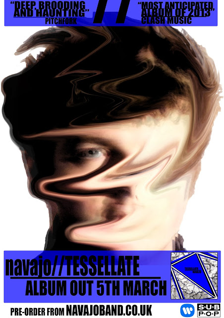
The original image of sam is exactly the same, however I went a different way about the edit of Sam. I always wished to distort the features of Sam (see research & planning for advert auxillary texts) as seen in the blurred, 'ghosting' effect of Sam's face in the original draft. This text however completely distorts Sam's face, yet not too exsessively that he is completely unidentifyable - the audiance still need to see it is the same person from the music video on the advert. The darkness of Sam's face also allowed for a colourful backround which would reinforce the visual presence that the darkened image thart Sam's face had. This would be ideal for attracting the audiances attention to the funimental poiunt of the advert; to see the actor/band members face. Further editing and the addition of graphics to the image reuslted in this:
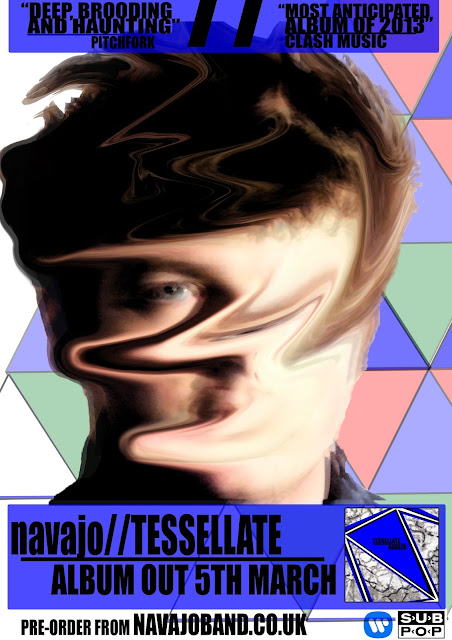
Comparing my final advert and the original draft, there is a significant obvious development in the images. The tesselation pattern -as discussed in the 'Magazine Page Advert' post previously - has relevence to the song and the whole thematic underpinning of the song which relates to the concept of the 'love triangle'. The geometric triangles also enhance the image as suspected, as well as ridding the blank whiteness of the original advert. I did however wish to keep a small fraction of white on the page rather than saturate the page with colourful triangles which would look bland and repetitive, contradiciting the attractive visual purpose of the advert.

The magazine that I used the content page of is 'The Fly', a free music magazine published by HMV's owners MAMA Group.The Fly is interestingly only an A5 sized magazine, for convenience sakes. The magazine has no real set genre, yet predominantly reviews and promotes new music of all varieties. Researching into costs of publication for advertisement concluded that to position this advert on the inside cover of the magazine would cost £4,000. Alternatively, a full page advertisement inside the magazine, rather on the inside cover would cost £3,000. I chose the more expensive option as this would guarantee attention: everybody will look at the inside cover, yet some magazine readers are simply 'flickers', especially when the magazine, such as The Fly, is free. With this in mind, the 'flickers' will look at the content page to see the content that they only wish to see and avoiding other music news they do not care about and still absorb my advertisement. This price is relatively cheap, considering the next cheapest value for an inside page advert is £6,000 from Clash magazine.
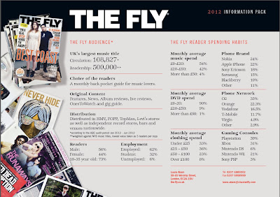
This is The Fly's media demographic information. With a readership of 500,000 (half a million!), the magazine is a fairly popular magazine. I put this down due to the easy accessibility to the magazine as it is a free magazine and a largely distributed magazine. These figures show that almost three-quarters of readers are 18-35, a demographic of which my selected audience. These figures also show that almost one-third of readers are student. I thought that a free magazine would be ideal for students, thus another valid reason for advertisement placement in this magazine.


(Shoot with Sam , a set on Flickr.)
These are some of the images that I was to initially use for my two auxiliary texts. The first four images of this set show the DIY backdrop; a big sheet draped over curtain rails, which actually worked rather effectively. I also used my personal spotlight to enhance the lighting of the shoot so that the images would become much more defined and clearer, a better quality for manipulation to make an advert or digipak. After taking the shots, I had to decide upon which image would be ideal to use for manipulation and editing and I decided upon this one to edit:
 I chose this image because Sam is not looking directly at the camera, yet looking in the general direction of the camera. This evokes an idea that Sam is ignoring or looking past the audience, retaining within the diegesis of the video and this advert; breaking realism can undermine the advert or look too 'cheesy', trying too had to connect with the audience. Additionally, the light on Sam's face is even and doesn't have too many shadows obstructing his facial features. One problematic, yet minor feature of this image is the red eye effect created on Sam's eyes due to the conflicting light from the flash and from the lamp i used. This was, fortunately, easily deleted with use of the Red-eye Removal Tool on Photoshop. The framing, however, is slightly obscured, with Sam only partially filling the frame, yet I always had the intention of only using Sam's outline: the purpose of the white backdrop made editing and cutting Sam from the fame much easier, as well as giving a reflective surface to shine light back on Sam. This would then make it an ideal image to place on the page to create an advert. With consideration of mise-en-scene of the video, I retained the colour scheme of thorough blue colour, however, upon reflection, this was completely redundant anyway as I only used the facial shot of Sam; I should have just taken a clse up of Sam's face with lighting on Sam's face, where I would not have needed to zoom and enhance the face cut out I did on Photoshop which actually reduces the quality of the image.
 Research provided a basis for a successful final product I beleive, yet obviously with some pit-falls. Initially, strucutring a first draft of the advert created using the textures considered for the digipak.

The image was too white, with too much blank space; which did on conform to the conventional display of a magazine advert which have the purpose to utilise page space and catch the readers eye; which I felt this original draft did not. However, I did wish to transfer the traingular shapes, to create a true tessellation pattern. This would fill the empty space on the page and create a more colourful and attention provoking text. Additionally, the opacity and light exposure/contrast on Sam's face after editing and placement on the page was too light, creating an almost blurred effect which I did not want; I only intended to layer the image, duplicated upon another. The syntax of the advert and the graphological placement of each banner (seen at bottom and top of the advert) was satisfactory and I thought no need to alter this structure.
This is an example of how initial drafting is ideal when creating a visual text, where I can easily reflect upon something I dont think satisfactory and re-do the text or make some sort of alterations to the text. With all the self-critisism I gave myself for my first advert; as well as some from peers who have told me about the adverts 'blankness', I could make ammendments to improve this speicfic auxiliary text to accompany my music video.
The process I went through to ammend my initial advert was still using the structure of the draft, yet visually make the advert more appealing to the audiance. My main objective was to give the addition of colour in the image and make Sam's face more prominent in the image, thus editing to darken this image. I disregarded the idea to use textures for my second, ammended peice due to the bland black white and grey colours and instead used the four triangle tesselation of the original draft to enhance cololur fo the advert and fill space. This would contrast well with the darker edit of Sam's face that I had manipulated on Photoshop. Here is the template of Sam's face that I used, then elaborated upon:

The original image of sam is exactly the same, however I went a different way about the edit of Sam. I always wished to distort the features of Sam (see research & planning for advert auxillary texts) as seen in the blurred, 'ghosting' effect of Sam's face in the original draft. This text however completely distorts Sam's face, yet not too exsessively that he is completely unidentifyable - the audiance still need to see it is the same person from the music video on the advert. The darkness of Sam's face also allowed for a colourful backround which would reinforce the visual presence that the darkened image thart Sam's face had. This would be ideal for attracting the audiances attention to the funimental poiunt of the advert; to see the actor/band members face. Further editing and the addition of graphics to the image reuslted in this:

Comparing my final advert and the original draft, there is a significant obvious development in the images. The tesselation pattern -as discussed in the 'Magazine Page Advert' post previously - has relevence to the song and the whole thematic underpinning of the song which relates to the concept of the 'love triangle'. The geometric triangles also enhance the image as suspected, as well as ridding the blank whiteness of the original advert. I did however wish to keep a small fraction of white on the page rather than saturate the page with colourful triangles which would look bland and repetitive, contradiciting the attractive visual purpose of the advert.
Overall, this advert personally grasps the attention of the audiance with a clear purpose done through the large font text at the bottom of the advert, =giving the audiance a message of release date and the offer to pre-order the album seen at the very bottom of the page. The visual aspect of the advert some may find slightly confusing or nihilistic, yet adiances who simply look at the advert and move on in the magazine may just appreciate the brightly coloured visual style, rather than be critical of the deeper meaning of the images and advert.
Magazine Advert: Integrated Into A Media Text
This is my album release poster placed beside the content page of existing music magazine content page, The Fly from Febuary 2013:

I did research into the conventional placement of advertisements and album release posters in music magazines and discovered that the two most prominent placements were the inside page of the front cover (as seen above) and the very back page of the magazine. I decided that placement next to the content page would be most suitable, thus using Photoshop I placed the content page and the advert next to one another.
The magazine that I used the content page of is 'The Fly', a free music magazine published by HMV's owners MAMA Group.The Fly is interestingly only an A5 sized magazine, for convenience sakes. The magazine has no real set genre, yet predominantly reviews and promotes new music of all varieties. Researching into costs of publication for advertisement concluded that to position this advert on the inside cover of the magazine would cost £4,000. Alternatively, a full page advertisement inside the magazine, rather on the inside cover would cost £3,000. I chose the more expensive option as this would guarantee attention: everybody will look at the inside cover, yet some magazine readers are simply 'flickers', especially when the magazine, such as The Fly, is free. With this in mind, the 'flickers' will look at the content page to see the content that they only wish to see and avoiding other music news they do not care about and still absorb my advertisement. This price is relatively cheap, considering the next cheapest value for an inside page advert is £6,000 from Clash magazine.

This is The Fly's media demographic information. With a readership of 500,000 (half a million!), the magazine is a fairly popular magazine. I put this down due to the easy accessibility to the magazine as it is a free magazine and a largely distributed magazine. These figures show that almost three-quarters of readers are 18-35, a demographic of which my selected audience. These figures also show that almost one-third of readers are student. I thought that a free magazine would be ideal for students, thus another valid reason for advertisement placement in this magazine.
Wednesday 13 March 2013
First Draft
This is the first edit
of a complete video that I have made. There are some minor faults with the
video, such as disruptive graphics and images and some visuals which we did not
intend to appear in the video yet perhaps these visuals work better
than the original 'scripted plan': spontaneity isn't always a
weakness.
The video still follows
the intended ambiguous, loose narrative as a result of the montage editing
style intended which was dependent more upon visuals and aesthetics than a
narrative for the audience, allowing more creativity.
The under-laying thematic of blinking is seen as a result of the editing technique with fractured,
random cuts to black as well as the strobe lighting MES chosen. This
blinking effect denotes the speed of the love that the protagonist has forsaken.
The blinking also gives an additional disorientating effect, coupled with
numerous blurring and dissolve in/out editing transitions.
As
promised there is also the short extract from the film The Good, The Bad & The
Ugly, which the lyrics of the song refer to. This inter-textual
reference works well within the video, allowing similar cinematography and
editing techniques, such as the close-up shots at the start of the video
of the three character's facial features and the
rapid cut editing of the three character's faces in the latter
half of the video. Another blatant MES aspect of the video is the inclusion
of the sun and the sun set in the video – denoting the end to the relationship for
our protagonist and the romance in the video, Fran. This is seen in certain
establishing/ extreme long shots, the circular visual flare taken from the Xbox
360 music visualiser and certain lighting effects of the MES such as the
gliding light seen at 1.01 and in another instance in the video.
Subscribe to:
Posts (Atom)